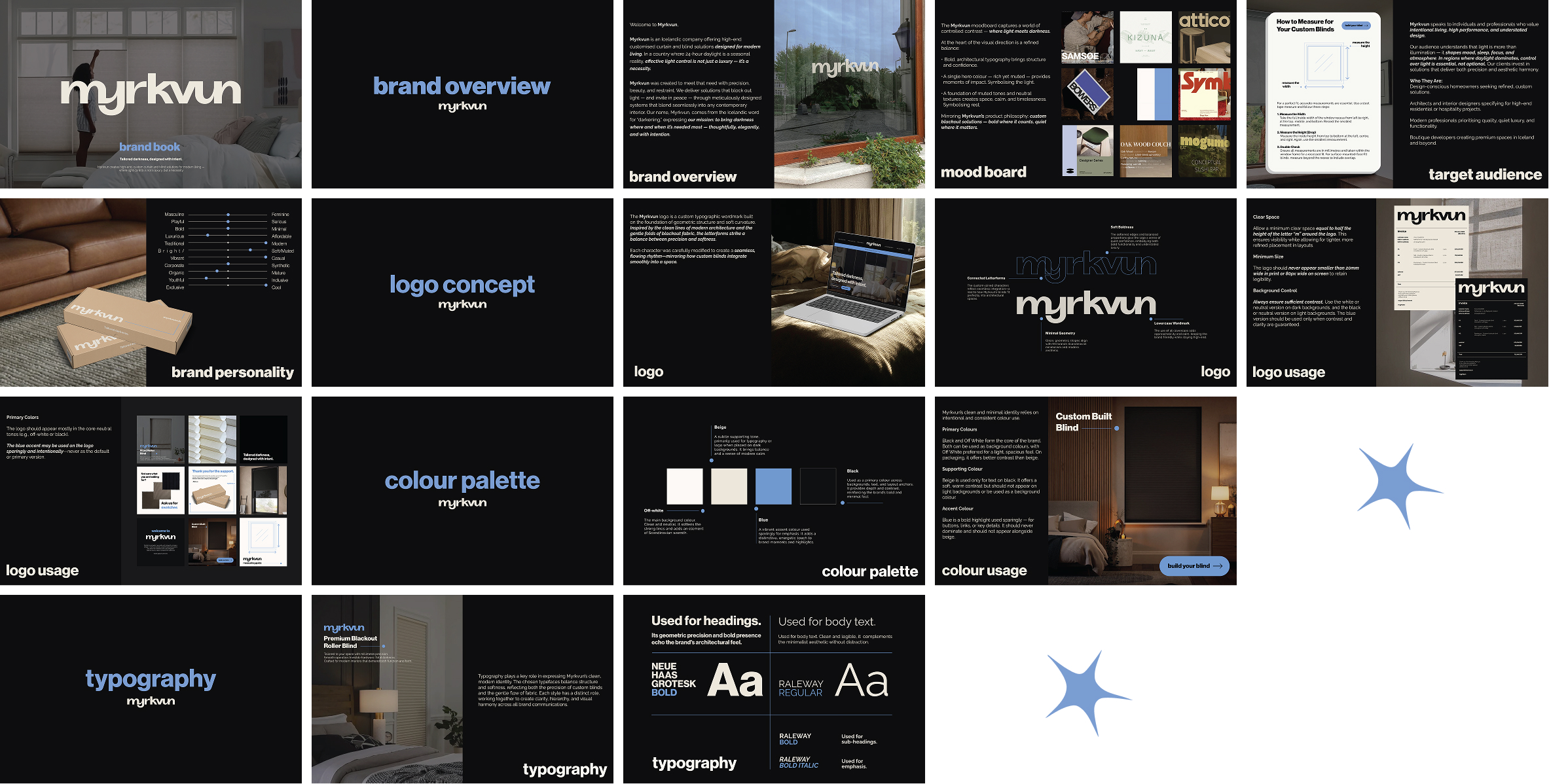
myrkvun
Myrkvun means darkening in Icelandic, and the brief was exactly that: an identity built around the precision and quiet luxury of blocking out light. In Iceland, where 24-hour daylight is a seasonal reality, Myrkvun offers custom blackout blind and curtain solutions for modern living. The visual system had to feel considered and restrained, bold where it counts and calm where it matters.


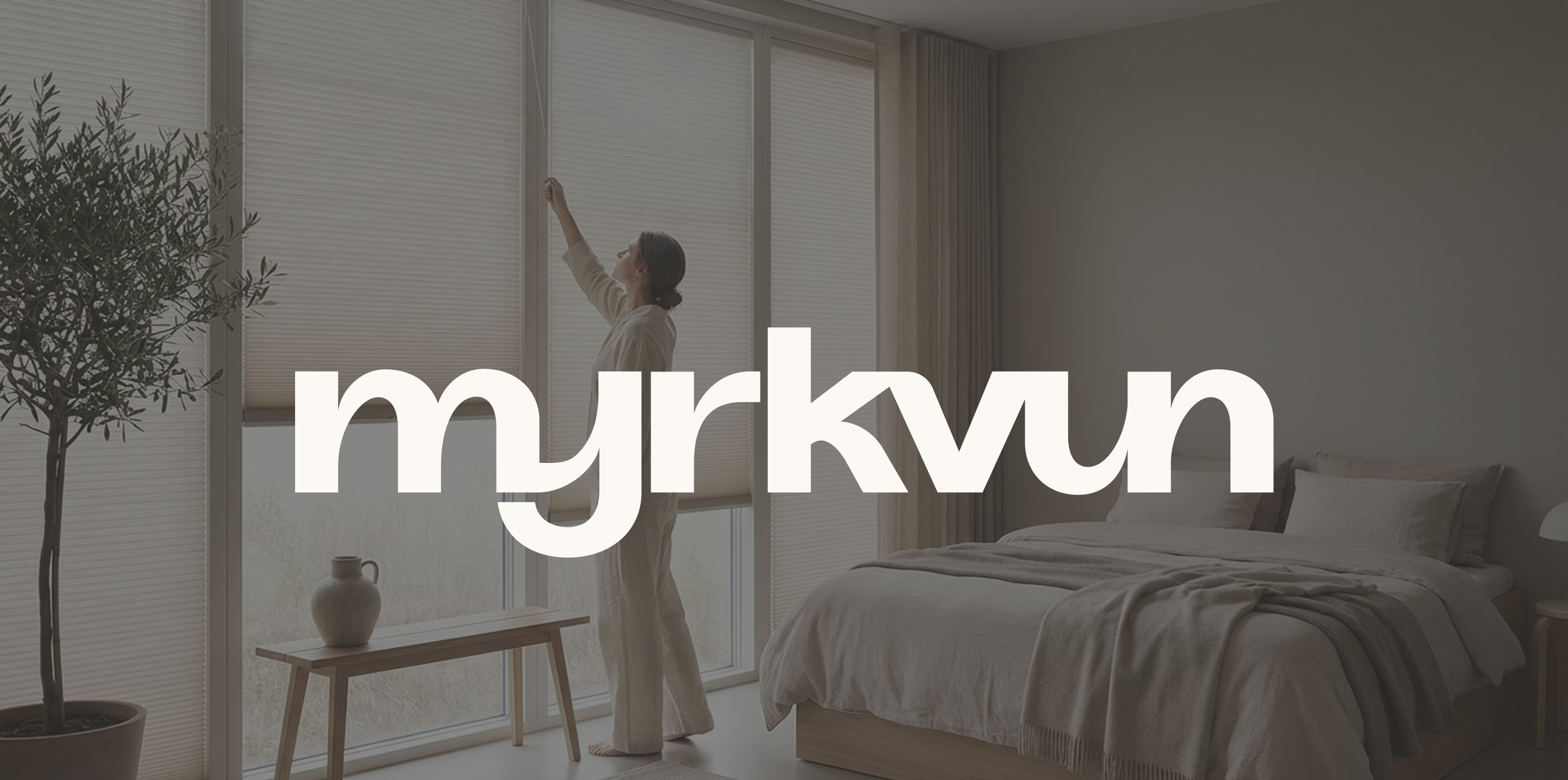
I developed a custom typographic wordmark, paired with a restrained palette of black, off-white, and a single blue accent. The system was designed to translate seamlessly to the website, with a primary focus on establishing a cohesive digital identity supported by complementary design collateral.
The Myrkvun logo is a custom typographic wordmark built on a foundation of geometric structure and soft curvature. Inspired by the clean lines of modern architecture and the gentle folds of blackout fabric, the letterforms balance precision with softness. Each character was carefully modified to create a seamless, flowing rhythm, mirroring how custom blinds integrate smoothly into a space.